Design Discovery Day
As soon as our collaborative showroom ‘The Post House’ opened its doors, we knew it was the perfect space to host events and welcome people in through the doors. An immersive design experience bringing together skilled artisans to share their knowledge and secret insider tips was first on the agenda…
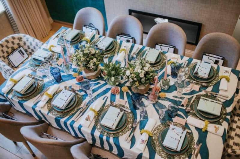
The focus of the day was to showcase a Spring table styling tutorial using some of our favourite products and methods for a beautiful table dressing.

Read on for the key ingredients which we can now share here:

Step 1 – Lay the Base Layer
When dressing a table, choosing a statement table cloth is key to building an interesting palate. Here, we have gone to town, using this lovely Summerill & Bishop zebra-inspired tablecloth as the backdrop to the evening and the inspiration behind the table’s theme. As Summerill and Bishop say, ‘It’s as simple as this: If we wouldn’t hang it on our wall, we’d never lay it on our table’. This cloth comes in bright orange too and various sizes, it will quickly transform your dining room!
The base layer also consists of the place mats, plates and cutlery. We usually create a base layer of one colour and then add touches of other colours subtly throughout the table dressing process that pull on each other. We sourced these place mats from Orange and Dutch, we have also found similar from The White company (Seagrass Woven placemats) and chose them for their perforated open weave and natural look – we wanted to make sure the tablecloth was visible through them, and though they are green and stray from our one colour base layer advise, we knew that the colour would ultimately draw on the flowers. Similar plates are available at Louis Potts Lewes, and the cutlery is from Neptune. In this instance, we laid the knife and fork together on the left side of the plate, to leave room for the napkin on the right-hand side.
Step 2 – Make Room for your Blooms
Blooms – quite literally – add a burst of life to your table. We have used white lilac, white lizzy, alstromeria and parrot tulips as our key flowers here, but other flowers we favour are pale amnesia roses, hydrangea heads and delicate pink anemones. In terms of foliage, our favourites are eucalyptus or red eucalyptus, mimosa for a shot of yellow, craspedia and veronica for interesting texture and wax flowers make a good sprig. We wanted these flowers to feel relaxed, seasonal and ‘spring-like’, and not too formal like a handtied bouquet.
A great idea is to take your vases to your local florist (or online use Flowerbx)- and ask them to dress your flowers into the vase so they are beautifully arranged. The vases you choose are an important aspect also. At Stephenson Wright, we love to make use of trinkets from home – Juliette is fond of using a delicate jug from her mother’s silver cabinet, whilst Natalie often opts for her handmade vases from Jojo ceramics. Unusual vases add to the quirkiness of the table – we would recommend Klevering and Anthropology for vases, but you could choose a clear vase and leave the flowers to work their magic. We chose baskets for the table dressing to hide the vases and stems whilst also giving a more relaxed feel.
Flowers don’t always have to be real, we also use dried, faux and pretty porcelain floral accessories to add the natural touches – here we have used beautiful ceramic corals from Chive in complimentary colours as decorative table art. They feel natural and organic, and add interest texturally.


Step 3 – Made By Hand
For this table, we opted for handmade glassware from Daylesford stating ‘peace’ and ‘love’. These bold glasses add an element of fun to the table, and they are unique in the sense that each glass they produce is different.
Our good friend Judy Broad, a talented local calligrapher, often hand-writes the name cards for the table, and should we be providing a personalised bag for the table gifts, she will write the tags for these as well. Judy has a very versatile style of modern calligraphy that can be tailored to suit your evenings theme, and can mix inks to match the exact colour palate of your table dressing.
Napkin Know-how
For a more formal look – as we have done here – fold the napkin, and for a casual and informal look, knot the napkin. For this table, we have used ‘mythical creatures’ napkins by Kit Kemp, a natural choice. We love that the animals are hand-stitched, and the unexpected mythical nature really draws you in. A fun napkin ring makes all the difference; we have used some by Kim Seybert via Lux Deco to add a textural element as these are reminiscent for us of sea urchins or coral. We always source napkin rings in a colour that ties in with the flowers, but still stands out.
Another addition we love to a napkin is monograming. Tori Murphy is a great choice for this – we would go for one of her beautiful napkins (or even a wash bag for a table gift) monogrammed with the guest’s initials, your family name, or even your house name as one of our client’s suggested.


Step 5 – Create the Glow
The importance of candles is not to be underestimated when it comes to creating the ambience and intimacy desired for your dinner party. We love to use tapered candles; for a luxe feel, we use Angela Wickstead, but Ester & Erik are a good alternative if working to more of a budget. Both stock a wide array of colours that can be chosen exactly to blend with the tables’ colour palate. You could choose lanterns or tealights should you prefer – we love the impact of tapered candles but had to balance them out with low candle holders so they did not become overbearing. We used these ‘ice cube’ style candle holders by ILJ Brown but sadly these are no longer a stock item – good alternatives are available via Lux Deco.
Step 6 – Charming Touches
Charming touches bring another dimension to your table. A lovely touch you can add is a gift for the guests to take home – and you can lay the gift at the guests place settings for another layer of intrigue. In this instance, we have chosen two charming Japanese mindfulness books ‘Ikigai’ by Hector Garcia and Francesc Miralles, and ‘Wabi Sabi’ by Beth Kempton, and have complimented these with an African-inspired porcupine quill pen.
The book is tailored to the guests in this instance – as we all lead busy lives – and the colour blended seamlessly. The pen, sourced from Orange & Dutch, adds a fun element of whimsy and completes the book in some sense, providing texture with the Guineafowl feather – Juliette loves to incorporate a nod to South Africa. The zebra tablecloth and guineafowl feather combined with the animals on our napkins form the wild influence behind this table dressing, which we have named ‘Wild at Heart’.

STEP 7 – ET VOILA AND ENJOY!